Text warp FX Unit 20
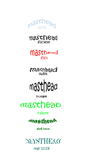
- Arch- I like the way the arch effect looks as I think it will be very useful for work we do throughout the year as it can wrap around possible pictures and edits we do in Photoshop.
- Fisheye-I dont like the way fisheye looks as It looks weird and doesn't look well in any types of font or font size which is why i dont like the way it came looks.
- Fish- I dont like the way the fish fx came out as it doesn't suit the font or colour of text i used
- Twist-I like the way twist looks as i think it would go well on a magazine which we are making throughout the year
- Bulge-I like the look of bulge as it looks well and i think it would go well as maybe a subheading on a magazine.
- Inflate-I think inflate didn't work to well with the colour of the font i used but it may be useful in the future for a possible magazine cover title.
- Shell Lower-I like the way shell lower looks and i think it will go well as a heading or caption under a image as it can wrap around the image.
- Squeeze-I dont like the way squeeze looks as it doesn't look well with the font or the colour, maybe if the font was larger it may have looked good

No comments:
Post a Comment