Photo Adjustments Photoshop...Unit 20
- The First Adjustment is 'Brightness and Contrast', I like this filter because it highlights the Red and Silver parts of the image which I like because it makes the image more eye catching.
- The Second Adjustment is the 'Levels', This Adjustment alters the layers in image and makes the darker areas darker and makes it seem more like a comic, which i like because it may be useful throughout studying digital media.
- The Thirds Adjustment is the 'Curves', I really like this Adjustment because it makes the Trophy look chrome and multi-coloured, which i good because it makes the image seem more eye catching.
- The Fourth Adjustment is the 'Exposure', I like this one as it looks similar to the second adjustment, but it doesn't look as good, so if i had to use one of the two, i would use the 'Levels' adjustment.
- The Fifth Adjustment is the 'Vibrance', i don't like the look of this adjustment as it only gives the image a grey scale look and doesn't correlate to the description 'vibrance'.
- The Sixth Adjustment is 'Hue and Saturation', I have mixed feelings about this one as it looks good due to the turquoise parts of the image but if i had to use this adjustment again i would only use it if it suited the image it was being applied to.
- The Seventh Adjustment is the 'Colour Balance', i like the look of this image because it gives the lighter parts of the image dark red, this is good because it takes the dominant colour of the image and spreads it throughout the rest of the image.
- The Eighth Adjustment is the 'Black and white', i think this Adjustment could be useful throughout the year as it looks like the image is from an old newspaper.
- The Ninth Adjustment is 'Colour Filter', I dont like this adjustment as it makes the image look green and removes the entire meaning of the image with the dominant red colour throughout.
- The Tenth Adjustment is the 'Channel Filter', i like this one as it makes the Red in the image more catching with it contrasting with the bright blue.
- The Eleventh Adjustment is the 'Threshold Adjustment', i like this one because it keeps the important sections of the image bright white and eye catching and then darkens the less important parts of the image which suits the image well.
- The Twelfth Adjustment is 'Pozterize', I like this one because it makes the darker areas of the image dark red and makes the lighter parts of the image bright red which looks good.
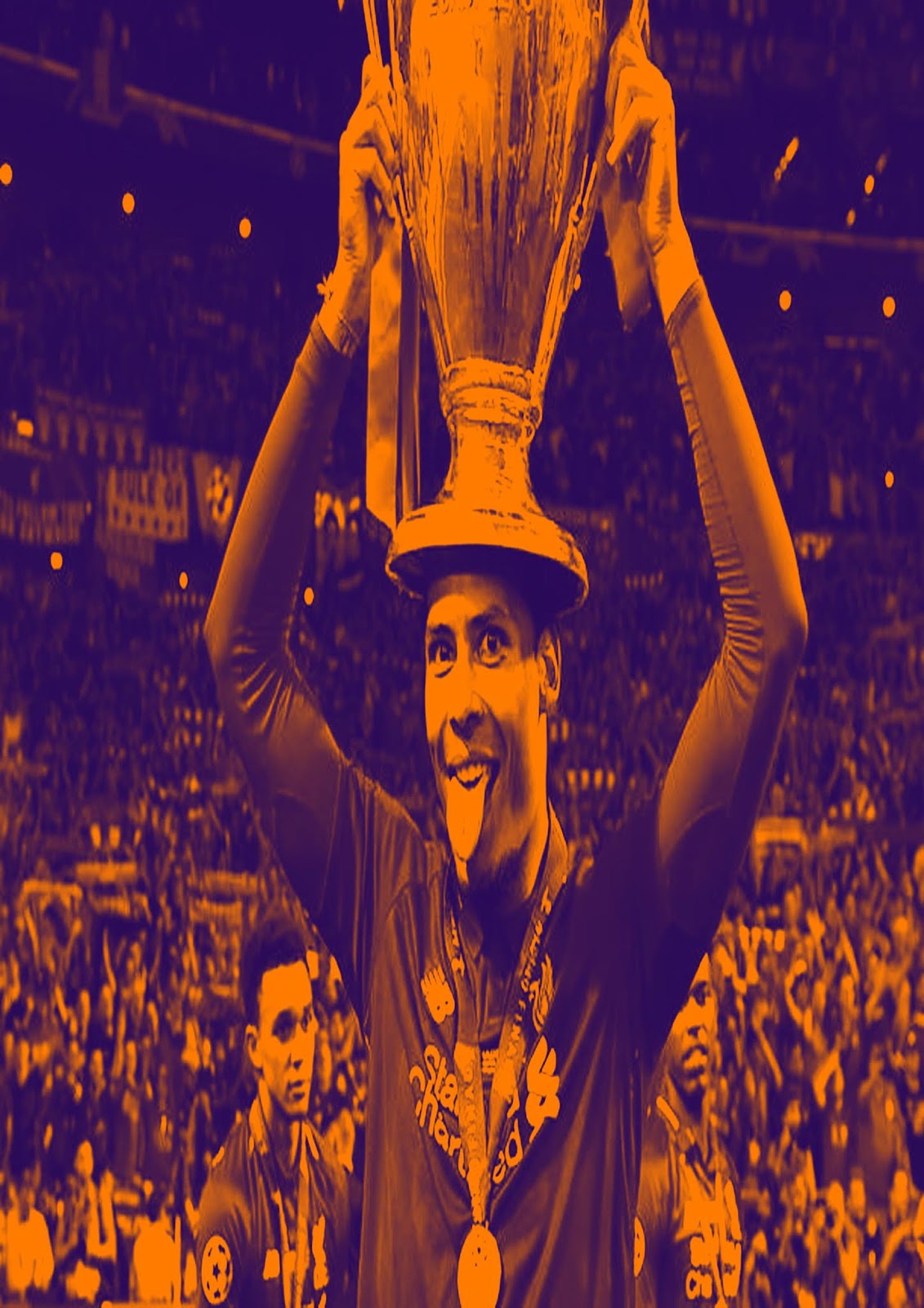
- The Thirteenth Adjustment is 'Gradient Map', I don't like this one because it makes the image look orange and purple which doesn't suit the image that its been applied to.
- The Fourteenth Adjustment is 'Match Colour', I don't think this one looks good because it just looks similar to the original image and it doesn't look like what I imagined.
- The Fifteenth Adjustment is 'Equalize', I like this one because it makes the image more eye catching and makes the image brighter.


these are really some quite nice effects looking at hue/ curves and other adjustments- you have combined this with the previous post of photo filters and again your commentary gives us the insight into your experience or creative choices - well done.
ReplyDelete